Interaction Design
RTE Player | App Redesign
RTE Player has some bad press. Our team identified the opportunities in its current design, then redesigned it to suit our user research. We tested and improved it adding new features, creating a better experience.
Duration
Dec 20 - Feb 2021
Project Type
Academic
User Experience Design
Contributors:
Aine
Tom
Michaela
Yaesin
Michaela
My Contribution
Research
Visual Design
User experience Design
Interaction Design
Test facilitator
01 Research
We identified improvement opportunities with RTE Players design through online reviews and user interviews.
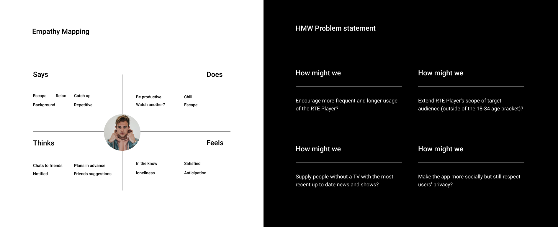
We, a team of 5 designers studying for their masters in user experience design, wanted to delve further into the opportunities, learn the user’s behaviour and provide an elegant solution.
We analysed the current app and used a mixed-method approach of quantitative and qualitative user research, helping us discover issues with error prevention, the efficiency of use, and overall navigation.
Users Want
To search and watch their favourite programmes easily
To watch programmes to relax
To switch off
Have tailored recommendations.
Our goal is to
Exceed users expectations
Differentiate RTE from competitors
Reduce the effort required to use the app
Highlight great content
02 The Design Process
Emphasising our persona and defining our problem, we created a to be task flow. When sketching the redesigned RTE Player, we were mindful of introducing new features to solve each stage of our to-be user cycle. We wanted to redesign the landing page to better showcase the content. The new features we created were:
Pick by Mood, Smart Pick, Share, Rating and Review, Live Chat, Profile Creation.
Our proposed to be task flows
Example Feature 01
Smart Pick
Our research told us users like to switch off and not have to think. To ‘quick browse’ or ‘watch without having to think’ we implemented a feature autoplay content when selected. Smart Pick is a floating action button (FAB) visible on the user's home screen. Naming the button ‘Smart’ indicates that it is doing something clever, instilling trust.
In testing, 40% of participants notice this feature at first glance, while 20% confirmed they would use it; however, there was little interest in it being ‘random’. We solved this by renaming it to ‘Smart Pick.’
Example Feature 02
Live Chat
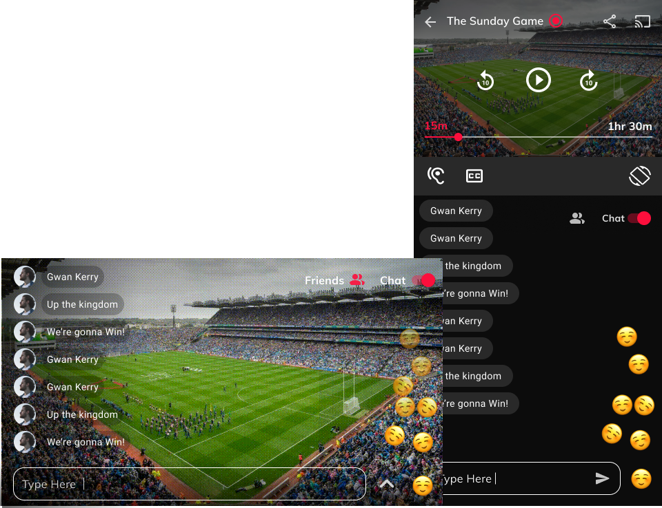
Live watching is one of RTE players a competitive edge. To engage users and entice socialisation, we wanted to implement live commenting and a live chat. The toggle asset keeps within contemporary design principles. While watching a live show, users can ‘toggle’ chat on or off.
In testing, participants we generally uneasy about chatting in a public channel. The ‘Friends’ filter option we had was unnoticed by the majority of participants. We solved this by clearly displaying the words ‘Public’ and ‘Private.’ 60% of participants approved this feature.
See the rest of the new features over on the Medium platform.
Early iterations of possible live chat solutions
04 Usability Testing
Our methodology for testing was mixed. We conducted moderated remote usability testing through different online tools for qualitative data.
Our objective was:
To test the new layout and features
To identify any usability issues across the app
To discover any navigation problems and identify confusing or unclear UI.
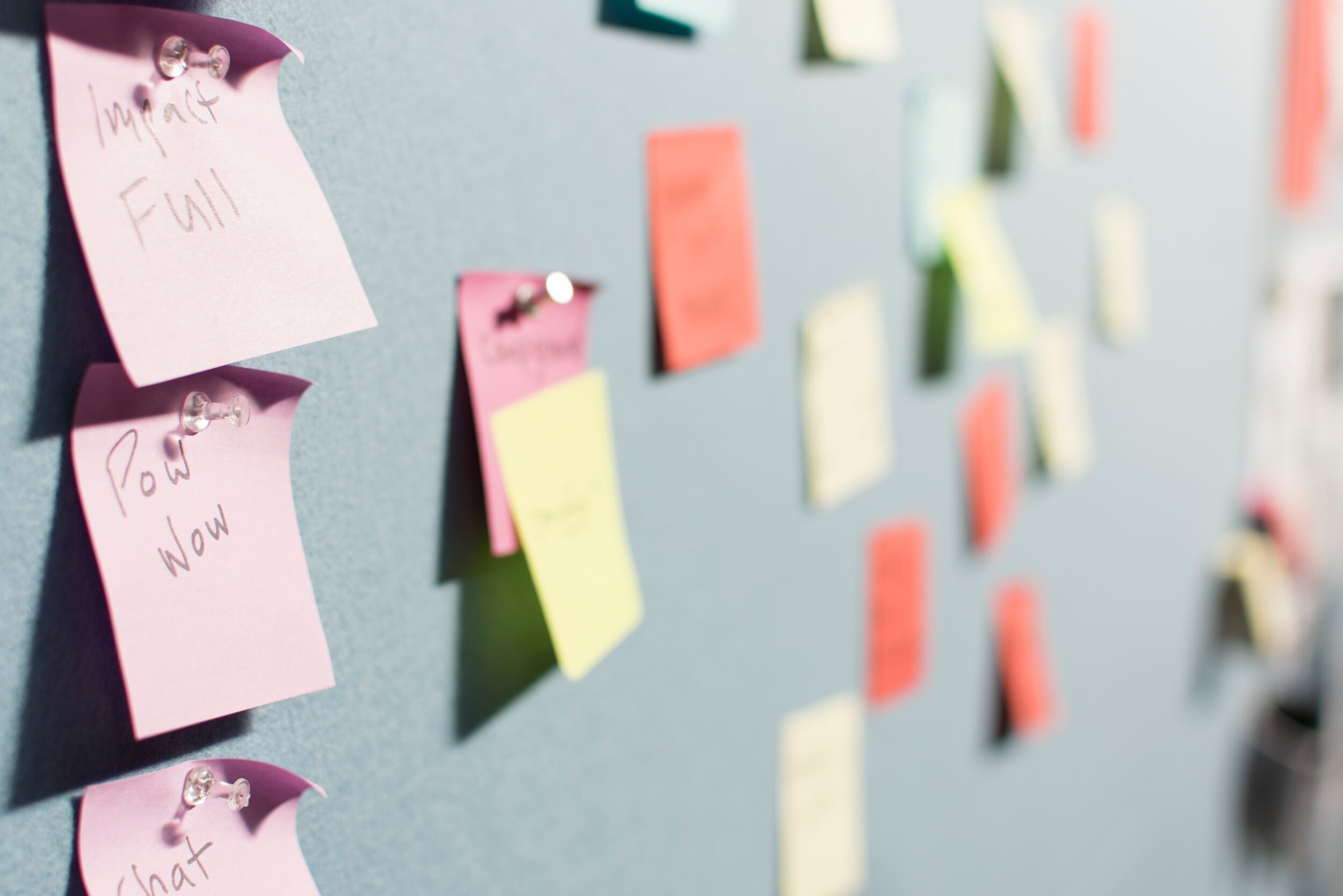
Post testing, we had a working group session. We grouped our cards according to themes, synthesised them, and identified recommendations based on those insights. We used The Action Priority Matrix to vote on effort and impact. We refined and tested our prototype.
The Final Prototype
What Changed?
Our research told us users wanted to watch content fast. The new RTE Player now has two ways, Smart Pick and Pick by Mood, for fast watching, based on the user’s history. The user may opt to create a profile giving them a more tailored experience. We’ve added ratings and reviews to learn their preferences. Live chat and chat with friends make it more than an entertainment app. It is also a social app.
The new RTE player uses familiar navigation patterns. Scrollable tabs and cards and fixed bottom navigation gave the users a recognisable UI pattern to follow. We showcased shows more appropriately and improved the overall hierarchy. Watch a walkthrough of the final prototype on Youtube.
Lessons learnt
01
Early & Frequent Testing
We did a small paper prototyping test but waited until later in the project to conduct planned usability testing
02
Interviews then surveys
It is best practice to use qualitative research methods to drive your quantitative. We learnt this after such
03
Work with existing users
The audience we interviewed were seasonal watchers. We found it challenging to find loyal viewers


